This post is a response to a question initially posed on Quora, and can also be accessed via “https://www.quora.com/Why-dont-newspapers-use-more-graphs-with-their-articles/answer/Antonio-Amaral-1“
A straightforward answer is that visuals are a LOT more time-consuming to create and fill a space than words.
What can be conveyed within a couple of paragraphs, taking only a few minutes to compose, can require at least an entire day of effort to create an infographic that depicts the same information.
Much of the reasoning for the judicious use of illustration is the cost and time required to prepare.
Newspapers are daily publications, so there is little time dedicated to comprehensive illustrations that can fill a page and convey what can be expressed through words. A daily cartoon for a cartoonist is a full-time job for a reason.
Weekly and monthly magazines have more freedom to include more visuals in their publications, which do attract more people and appeal to broader audiences, but they’re also more expensive.
Although graphs aren’t quite as time-consuming to create because many programs can generate attractive graphs from data, this is where the time-consuming challenge rears its costly head. Gathering data and refining it sufficiently to create a graph that complements an article can be beneficial if the story is data-intensive. Still, most stories are information-rich narratives that don’t translate into data parsing visuals.
Infographics are about telling stories, but creating them can involve several days of effort.
The (mostly very short) articles I compose here, which I further tweak and publish elsewhere and include illustrations, can take as long to create as the 2-minute-long article I write. I begin with an AI-generated image, which I then process through photo-editing tools that are sometimes composites of multiple AI originals. If I were to create illustrations from scratch, that would require a bulk of one day (4–6 hours) of cartoon-style illustration for an article I would have spent two to three hours composing.
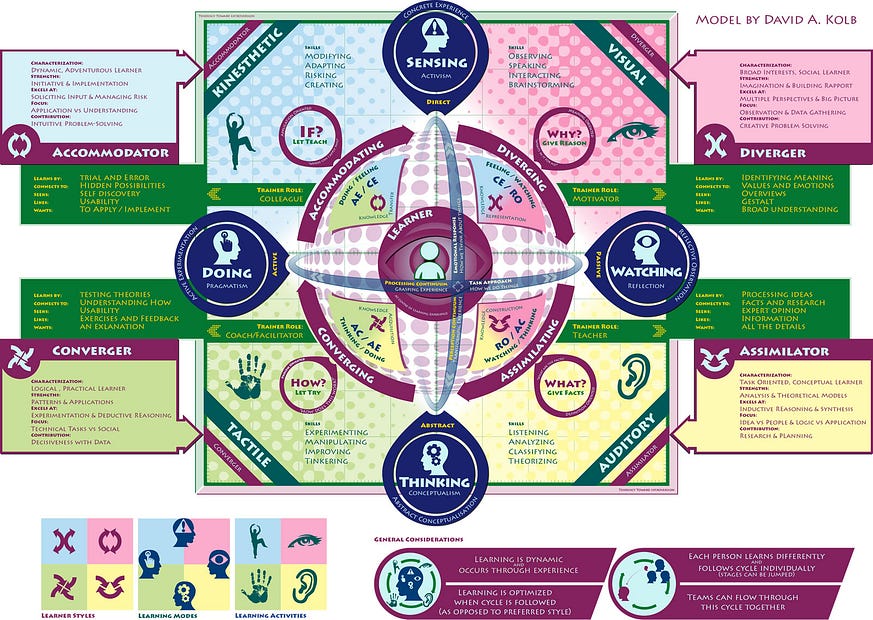
An infographic would require research in compiling data, research in identifying appropriate images to use (because it’s often faster to find glyphs to modify than it is to create them from scratch) and then arranging all of that into a pleasing visual that’s easy to follow is an evolutionary process that often requires moving stuff around to make everything fit in a way that guides a viewer’s attention. In short, it’s just more work to create an infographic. Creating unique and attractive infographics that clients want to pay good money for is a market on its own that I’ve thought of exploring at different times in my life but haven’t done so earnestly… and I kick myself for that because I’ve taken the notion of infographics much further into something I’ve called an edugraphic — which is essentially an entire course within a single graphic.
Here’s an example of one visual I created around David Kolb’s Experiential Learning Model — this took more than a week to develop (this was part of something I was working on before my life was upended) — in essence, this is a self-contained course within a single graphic which I refer to as an “edugraphic” rather than “infographic”: